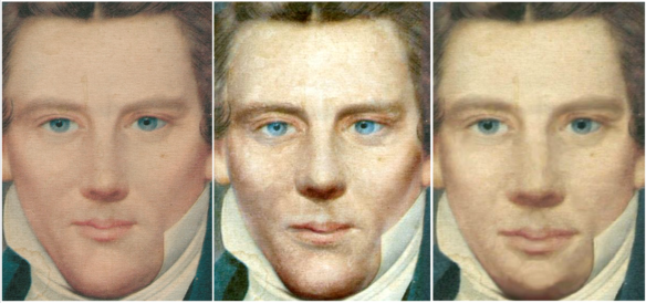
My concept was to overlay my altered image of Joseph’s face (the image on the right) onto the death mask, allowing some of the texture of the death mask to provide nuance to the image.
But when I showed the result to my husband (without informing him what I’d done), his comment was “the head looks too big for the body.”
This had nothing to do with my update, but everything to do with how I’d originally attempted to correct the proportions of the painted image.
I went back to the drawing board. This time I scaled the death mask to see how much I could get it to align with the existing image, rather than presuming I had to move everything on the face to align with the death mask (as proposed by Lorie Winder [ref]Winder, Lorie, “In Search of the Real Joseph Smith,” Sunstone, issue 24, Nov/Dec 1980, p. 31.[/ref] ).
It turned out that the original image I was working from (see the pretty face on the left above) aligned with the brows, eye centers, lips, and chin. The only thing that didn’t line up was the tip of the nose.
The nose on the original image is noticeably petite, so it never occurred to me that it could be too long. I shifted the tip away from the lips, towards the eyes, and underlaid the death mask. The result is what you see in the middle.